
The correct exterior color system uses a cohesive 3–5 color palette that clearly defines body, trim, and accents to create curb appeal that lasts beyond a season. The Color 101 course: choosing paint colors for homes provides a practical primer on undertones, lighting, and color coordination that informs exterior decisions and helps you avoid misreads from swatches.
| Decision Step | Quick Guidance | Useful Tool / Resource |
|---|---|---|
| Assess style & context | Match color scale to style (farmhouse with light neutrals; modern with bold contrasts) | Reference brand palettes (Sherwin‑Williams, Benjamin Moore) |
| Test visually | Test palettes on a real photo or via a visualizer before buying samples | Renoworks paint visualizer or manufacturer visualizers |
| Pick palette | Limit to 3–5 colors: main body, trim, secondary body or accent siding, door | Color cards and on‑home mockups |
Start with Architecture and Site for Color Authority
Color reads differently depending on form, massing, and texture. A large, articulated Victorian can carry multiple hues and restrained trim contrasts; a compact ranch benefits from fewer, stronger moves. Consider the roof color, major materials (brick, stone, siding), and the surrounding landscape. Colors should either harmonize with the existing palette or deliberately contrast to highlight architectural features. For concrete and siding choices, see Exterior Home Color Combinations That Will Transform Your House.
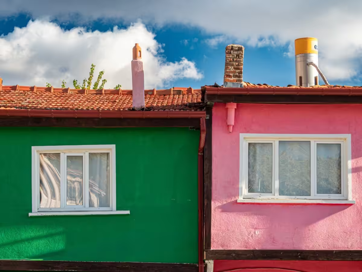
Climate, Light, and Orientation: Perception Shifts Over Time
Sun exposure alters color perception. South-facing walls glow in warm light, making saturated hues read brighter; north facades stay cooler and more muted. In hot climates, avoid deep colors on large planes that absorb heat and chalk more quickly. In shady, wooded lots, richer neutrals or greens help the home blend with nature while still offering clarity from the street. See how earthy exterior color combinations respond to landscape and light.
Visualize Early to Prevent Regret
Upload a clean exterior photo to a visualizer and apply multiple palettes to full-wall applications, trim swaps, and door colors. Tools like Renoworks provide realistic swatch placement and side-by-side comparisons that beat tiny chips for assessing scale and proportion. This early testing captures how tone, contrast, and texture interact on actual walls at different times of day. For more cohesive guidance, consult Whole House Paint Colors: Choosing the Perfect Palette.

Adopt a Cohesive 3–5 Color System
Limit to a focused set of colors and clearly assign roles to each. Typical roles include:
- Main body color (largest area)
- Trim color (windows, corners, eaves)
- Secondary body or accent color (optional siding or feature wall)
- Front door or focal accent
- Optional: porch ceiling or shutters if visually prominent
Structured color roles help the composition read as a unified whole rather than a patchwork of random hues. For a structured palette approach, see the guide in Whole House Paint Colors: Choosing the Perfect Palette.
Architectural Style and Palette Pairings
Different styles tolerate different color strategies. Examples of dependable pairings include:
- Traditional farmhouse: warm whites or creams with a darker door or trim for contrast.
- Craftsman: earthy tones with warm grays and natural wood accents to emphasize joinery.
- Contemporary: a strong, deep body color with white trim and a bold door as a focal point.
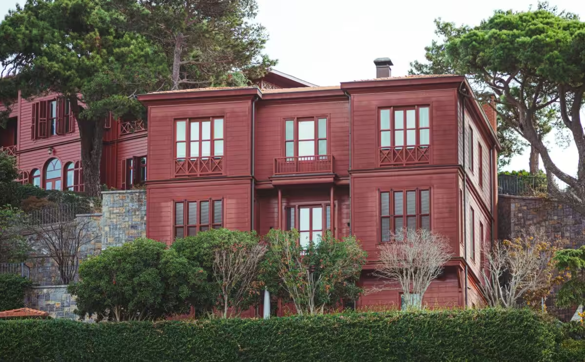
- Colonial or historic: restrained palettes using subtle off‑whites, muted blues, or classic reds that respect proportions.
Materials Matter: Brick, Stone, Wood, and Vinyl Guide Color Anchors
Exposed materials anchor your palette. Painted brick should either recede or harmonize with mortar tones; darker paints emphasize form, lighter paints can soften texture. For vinyl or composite siding, check manufacturer recommendations—pigments can behave differently on plastics. A practical move is to test a 12"×12" painted sample across different elevations and lighting to see how it ages with the surface. For reference on broader color strategies, explore Earthy Exterior Color Combinations.
Brand Resources and How to Use Them
Major paint brands provide exterior color guidance and visualization tools. Use these resources early to narrow options and learn about suitable sheens and primers for your substrate. For instance, exterior color guidance from top brands helps align roof, landscaping, and body/trim choices in a cohesive way. See brand collections and color cards to jumpstart combinations and practical application notes. See also the broader palette guidance in Exterior Home Color Combinations That Will Transform Your House.
Resale-friendly Neutral Ground and Bold Front Door Moments
If resale matters, favor broadly appealing neutrals and nature-inspired tones. Bold color can work as a selective accent—try a saturated front door or a chosen shutter color to maintain broad market appeal. Remember that curb appeal is enhanced by maintenance, not just color, so align color decisions with condition and upkeep. For palette examples that balance tradition and modernity, see Top 10 Exterior Paint Colors That Increase Home Value.
Front Door and Accent Strategy That Delivers Impact
A vibrant front door can transform perception without overwhelming the entire house. Consider jewel tones, deep blues, greens, or even a dramatic black, tested against daylight and dusk photos. Use accents (like shutters or a porch ceiling color) to add personality while keeping the main body neutral for resale flexibility. For a curated palette framework, reference the 3–5 color system discussed earlier and in the related critique of color families.
Practical Testing: How to Do It Efficiently
Request real paint pints or color swatches and test two to three 2×2 panels on different elevations. Observe across multiple days and lighting conditions. If speed is essential, begin with a visualizer to prune options and then confirm with physical samples. Finish choices influence color perception, so be mindful of satin/low-sheen vs. gloss on different surfaces. For a quick, practical buying option, explore exterior color swatch kits available online: Exterior house paint color swatch kits.
Durability, Sheen, and Maintenance Realities
Exterior paint must resist UV, moisture, and dirt. Higher-quality formulas cost more upfront but often deliver longer life and fewer repaint cycles. Sheen matters: satin or low-sheen on siding hides imperfections, while a glossier finish on trim and doors offers durability and easier cleaning. Always follow the substrate prep and primer guidance from the manufacturer. For further guidance on cohesive palette strategy, consult Whole House Paint Colors: Choosing the Perfect Palette.
Common Pitfalls to Avoid
- Relying only on small paint chips that hide scale and context.
- Ignoring fixed anchors like the roof and hardscape colors.
- Neglecting neighborhood covenants or HOA color rules.
- Overlooking undertones that can clash when two grays or neutrals meet.
Today’s Practical Workflow You Can Start Now
- Photograph your home from the curb and up close on a clear day to capture materials and textures.
- Test three distinct palettes using a visualizer (neutral, contextual, bold accent).
- Choose 2–3 favorites and order sample pints; apply on representative walls.
- Assess the samples over 3–7 days in varied light before committing.
Additional Help and Trusted Tools
Manufacturer resources are reliable starting points for color formulas and technical guidance. For high-fidelity photo testing, consider professional visualizers that let you compare shades side by side. If resale is a goal, consult current market data and color analytics to inform choices that enhance photos and buyer perception.
Useful links: Sherwin‑Williams exterior resources, Benjamin Moore exterior collections, Renoworks paint visualizer, and practical market commentary on upgrades and selling.
Sherwin‑Williams exterior resources: Sherwin‑Williams exterior house colors
Benjamin Moore exterior collections: Benjamin Moore exterior collections
Renoworks paint visualizer: Renoworks paint visualizer
Color 101 course: choosing paint colors for homes
Color Examples and Practical Inspirations
Popular exterior color themes often begin with warm whites or greiges for broad appeal, with darker trims or bold doors providing contrast. If you’re curious about current palettes, explore color families like neutrals, greens, and deeper blues, with attention to undertones and how they react in different light.
As you experiment, keep in mind: a well-tested color story can elevate curb appeal and support a strong, publishable look for your home—whether you’re selling or simply loving the way it reads on the street. Share your color journey in the comments below—what palettes are you considering, and what moments are guiding your choices?

Picking Colors For Your House! | Exterior Paint Colors 2022:
Choosing the right exterior colors for your home can feel like a big task, but it’s also an exciting opportunity to express your personality and enhance your curb appeal. Remember, the final choice should resonate with your aesthetic preferences while harmonizing with the surrounding environment. Take your time, gather samples, and envision how each color will look throughout the day. After all, finding the perfect hue can truly transform your home into a beautiful reflection of you.
Stay Inspired and Connected
As you embark on your color journey, don’t hesitate to seek out inspiration from various sources. Social media platforms are treasure troves of ideas, and you might find the perfect shade just by scrolling. For more fantastic design tips and inspiration, check out our Instagram where we share the latest trends and beautiful transformations that might spark your imagination. Happy painting, and may your home shine in its new colors!
