
Pride Design: Visual language growth shows how a simple color sequence became a durable system for identity, safety, and political visibility across decades. This article traces the rainbow flag’s trajectory from a local activist emblem to a globally adopted design language that informs spaces, brands, and public memory, while acknowledging the practical realities of displaying and maintaining these symbols in real environments.
Foundations: from protest symbol to public sign
Early LGBTQ symbols emerged from necessity in oppressive contexts, where covert cues enabled recognition without exposure. The rainbow flag’s 1978 introduction by Gilbert Baker for San Francisco Pride established a portable, non-proprietary language that communities could reproduce and adapt. The flag’s evolving color palette—originally eight colors, later reduced to six—illustrates a design principle: maintain core meaning while simplifying execution for durability and widespread reproduction.
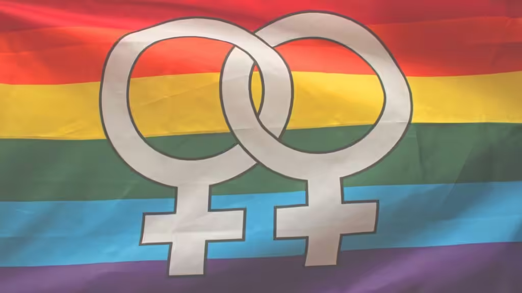
For a concrete, official exemplar of public-symbol design in state spaces, see the LGBTQ Veterans Memorial page from the California State Capitol Museum, which documents iconography such as the pink triangle and the memorial’s status as a state symbol. LGBTQ Veterans Memorial - California State Capitol Museum
Iconography in public memory
Public memorials and flags share a goal: legibility across sizes and contexts. The rainbow’s broad color sequence remains recognizable on banners, pins, digital icons, and large-scale installations, while newer versions foreground inclusion—trans colors and colors representing people of color—through deliberate rearrangement or added chevrons. The design challenge is to preserve legibility when symbols are reduced for small formats or embedded in multi-brand environments.
Practical implications for designers and space owners
When deploying Pride symbols in architecture or interior design, prioritize: high-contrast, scalable geometry; durable materials for exterior exposure; and culturally informed curation through community engagement. Flags installed in outdoor settings must consider wind load, UV resistance, and secure mounting hardware, while interior displays can rely on stable fabric or digital representations that reproduce color values consistently.
Symbol ecology: a spectrum of identities
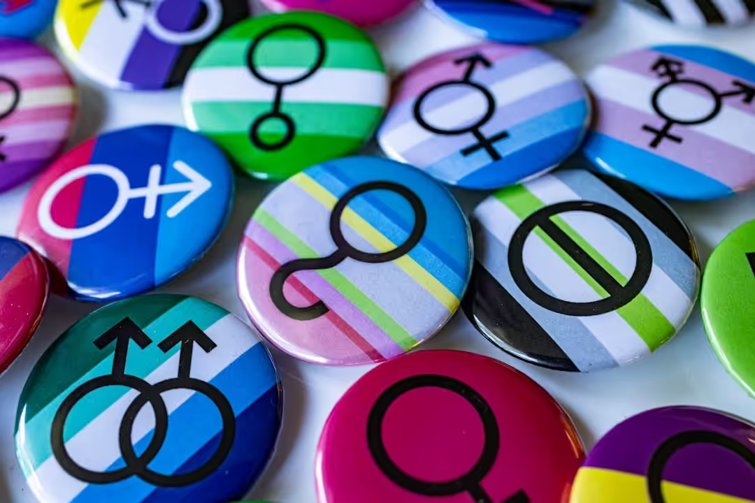
Beyond the primary rainbow, identity flags (bi, pan, asexual, nonbinary, gender-fluid, and more) function as compact, instantly recognizable marks. Their meanings can vary by community, so presentation should include contextual briefings in exhibitions or displays to prevent misreading. When space permits, pair flags with short explanations or integrated signage to preserve intent and foster inclusive understanding.
Design pitfalls and responsible display
Avoid overcomplication, poor contrast, and tokenistic use. Community consultation is essential to ensure that added symbols or color revisions reflect actual voices within the audience. Ethical stewardship matters: symbols are cultural property, and thoughtful attribution and support for related causes strengthen credibility and reception.
Where consumer artifacts fit into the design picture
In exhibition or retail contexts, consumer-facing artifacts such as flags, pins, and decor items can extend the design language into everyday spaces. When selecting these items, rely on durable construction and clear color values to maintain fidelity across display formats. For shoppers seeking a wide range of flag-related offerings, consider curated options that ensure color accuracy and material quality. rainbow Pride flags and related accessories.
Public display best practices: a quick checklist
- Confirm the symbol’s intended audience and the setting (public space, event, or interior display).
- Choose a low-maintenance material and finish suitable for the locale and climate.
- Provide contextual signage to explain meanings and avoid misinterpretation.
- Prefer non-proprietary designs or widely accepted color values to support broad adoption and local customization.
What to watch next in Pride symbolism
Ongoing developments include increased emphasis on intersex visibility and localized variants that reflect specific histories. The balancing act remains: preserve legibility and durability while expanding inclusivity in both physical and digital spaces. Designers should track color-accuracy guidelines and accessibility considerations to ensure that symbolism is legible for all readers and viewers.

We invite readers to share experiences with Pride design in spaces you care about. If you’ve used a flag or emblem in a particular context, tell us about it in the comments or share photos that demonstrate how Pride design translates into architecture, interior design, and urban spaces.
From Art to Icon: The Evolution of the LGBTQ Rainbow Flag:
The journey of LGBTQ symbols is a vibrant tapestry that reflects the evolution of a community’s struggle, triumphs, and ongoing quest for visibility and acceptance. From the iconic rainbow flag to the more recent inclusion of a diverse array of colors and symbols, these emblems have not only galvanized pride movements but also fostered a sense of belonging and solidarity. As we explore their impact, it's evident that they serve as beacons of hope, encouraging individuals to celebrate their identities with fierce pride and resilience.
Join the Conversation
As we look ahead, it's essential to stay connected with the ever-evolving narratives of LGBTQ representation. Whether you’re a proud ally or part of the community, you can help amplify these voices. To dive deeper into this vibrant world of design and culture, I invite you to follow us on Instagram at Architecture Adrenaline. Together, let's continue to celebrate the power of symbols and the stories they tell, forging a future where everyone can express themselves freely and boldly.
