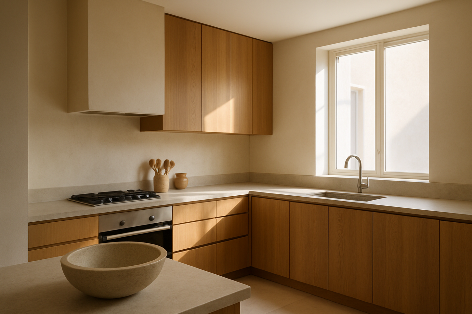
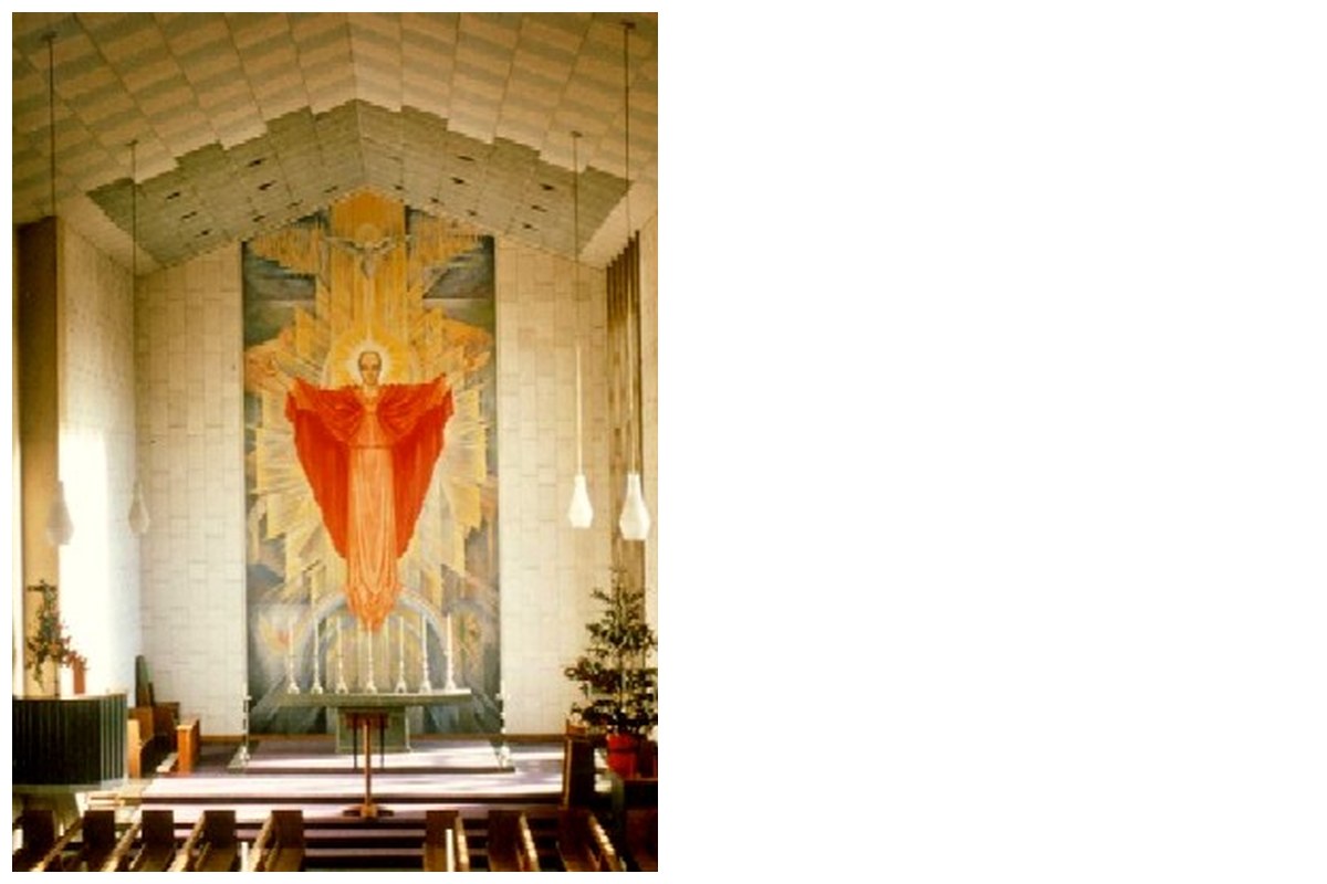

Natural light can transform interior spaces, influencing mood, perception of volume, and overall ambiance. This ranking evaluates ten carefully chosen interior color palettes that enhance natural light, based on their ability to reflect light, complement architectural elements, and balance warmth and brightness. Considerations include material finishes and typical light conditions to avoid common pitfalls such as glare or color shift. These palettes aim to assist Architecture Adrenaline readers in comparing thoughtful design options that optimize daylighting in varied contexts.
1. Warm Whites with Soft Beige Accents
Warm whites paired with soft beige accents create a luminous and inviting atmosphere by maximizing light reflection while preserving warmth. This palette works especially well in spaces with northern exposure, where light quality tends to be cooler and less direct. One practical detail is selecting matte or eggshell finishes to diffuse light softly and reduce harsh reflections. A caution is that overly warm beiges can dull the light's natural crispness, so balancing undertones is critical for maintaining vibrancy.
2. Cool Grays Paired with Pale Blues
Cool grays combined with pale blues introduce a serene quality that amplifies natural light through cool undertones that visually expand space. This duo suits modern interiors prioritizing minimalist aesthetics and pairs well with large glass surfaces. The reflective capacity depends on the lightness of the gray chosen, with medium tones potentially absorbing more light and diminishing the intended effect. Attention should be given to the gray's undertone to avoid creating an unexpectedly cold or dim environment.
3. Soft Pastel Greens with Cream Undertones
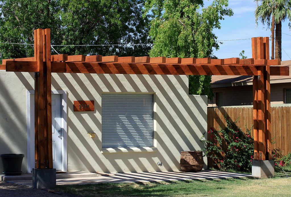
Soft pastel greens integrated with cream undertones evoke freshness and subtle vitality, enriching daylight by adding color depth without overwhelming brightness. This palette functions optimally in spaces with abundant indirect natural light, as pastel greens can shift under artificial lighting. Choosing light-reflective, satin finishes can enhance softness. However, caution is warranted as stronger greens may overpower natural tones and reduce the perceived light intensity.
4. Muted Terracotta Complemented by Sand Tones
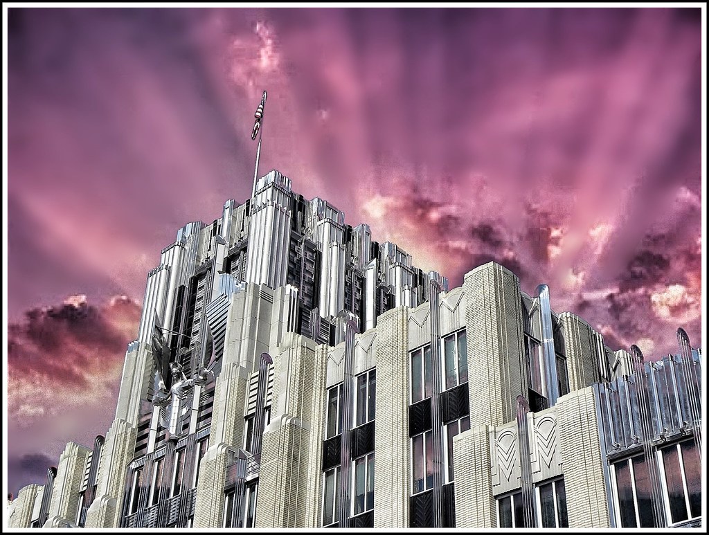
Muted terracotta combined with sand tones balances earthiness with light-reflective surfaces, introducing warmth that complements sunlight’s golden hues. This pairing is effective in rooms with western exposure where late daylight tends to be warmer. An important design detail includes coordinating the palette with light wood or stone materials for cohesive spatial warmth. The palette’s downside is in smaller spaces where darker terracottas may absorb ambient light, reducing overall luminosity.

5. Light Taupe with Subtle Lavender Hues
Light taupe accented with subtle lavender hues offers an understated elegance that gently modulates natural light to avoid stark contrasts. This palette is particularly advantageous in environments with fluctuating light conditions, as lavender undertones counterbalance taupe’s earthiness to maintain brightness. Fine-tuning the color proportions ensures that lavender does not become visually cold, which may detract from the space’s warmth under low light. Using multipurpose finishes can control light diffusion and avoid glare.
6. Crisp White with Natural Wood Elements
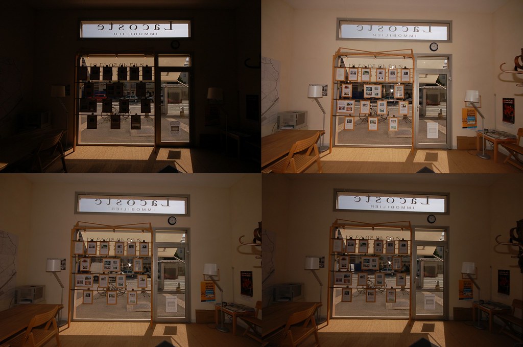
Crisp white walls combined with natural wood elements provide a classic, high-reflectance environment that maximizes daylight penetration and creates a balanced tactile contrast. Key to this palette’s success is selecting whites with neutral undertones to prevent color temperature clashes with wood textures. Wood choice and finish impact light absorption, so lighter woods with matte finishes are preferred. A potential drawback is that stark whites can cause glare in rooms with intense sunlight, requiring window treatments or diffusers for comfort.

7. Pale Mint Combined with Light Gray Neutrals
Pale mint paired with light gray neutrals delivers a contemporary subtlety that enhances light quality while introducing a soft, fresh color presence. This palette often suits interiors with eastern-facing windows where morning light is cool and diffused. Using semi-gloss finishes on the mint surfaces helps maintain brightness without overwhelming reflectivity. Designers should take care that the mint does not turn too dominant, which could introduce unnatural color casts under certain daylight conditions.

8. Ivory Base with Dusty Rose Highlights
An ivory base with dusty rose highlights creates a delicate yet immersive light-enhancing environment. The ivory foundation reflects light broadly while dusty rose accents provide warm depth and soften spatial edges. This palette works well with varied window orientations given its moderate reflectivity. When deploying dusty rose, the scale and finish matter; matte versions reduce reflection but too much can diminish luminosity. A design caveat is balancing saturation to avoid the dusty rose becoming a visual focal point that detracts from light enhancement.
9. Soft Lemon Yellow Paired with Off-White
Soft lemon yellow combined with off-white provides an invigorating color scheme that amplifies daylight by introducing cheerful warmth without aggressive brightness. This vibrant palette suits interiors with plentiful but indirect sunlight, such as rooms with skylights or shaded windows. To prevent sensory overload, the yellow should remain pastel and balanced with generous off-white expanses. Excessive yellow saturation or glossy finishes may cause unwanted chromatic shifts and visual tension in the space.

10. Light Greige Enhanced by Warm Metallic Accents
Light greige enhanced by warm metallic accents presents a nuanced palette that moderates natural light to create subtle sophistication. The greige base reflects light with more softness than pure whites or grays, while the metallic details create focal points that draw in light and add dimension. This palette is particularly effective in contemporary urban residences where indirect light predominates. However, warm metals can sometimes cast colored reflections, so placement and finish type need careful consideration to avoid uneven light distribution.

FAQs about Interior Color Palettes and Natural Light
- How do color finishes affect natural light in interiors?
- Finishes like matte diffuse light softly, reducing glare, while glossy finishes reflect more light but can create harsh reflections. Choosing the right finish is key to balancing brightness and comfort.
- Can darker colors enhance natural light?
- Darker colors generally absorb more light, reducing brightness, but can add depth when balanced with lighter surfaces. Their use requires careful calibration to avoid diminishing daylight effects.
- Is it better to choose warm or cool color palettes for natural light?
- Both warm and cool palettes can enhance natural light depending on the room’s orientation and desired ambiance. Warm palettes complement warmer light, while cool tones work well under northern or shaded light.
Choosing an interior color palette that enhances natural light involves balancing reflectivity, undertones, and material finishes tailored to specific lighting contexts and design goals. The ten ranked palettes outlined offer distinct approaches to leveraging daylight’s qualities—ranging from warm neutrals to delicate pastels and nuanced greiges—that Architecture Adrenaline readers can adapt for various spatial conditions. Thoughtful palette selection supports functional lighting alongside aesthetic considerations, enabling interiors that intelligently interact with their natural light environments.
For more architecture, cities, public spaces, materials, and design ideas, browse Architecture Adrenaline’s latest guides.
AI-Generated Design Concepts
These concept images were generated to help visualize the ideas in this guide.