
Origins and Philosophy
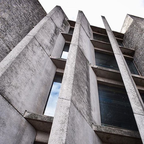
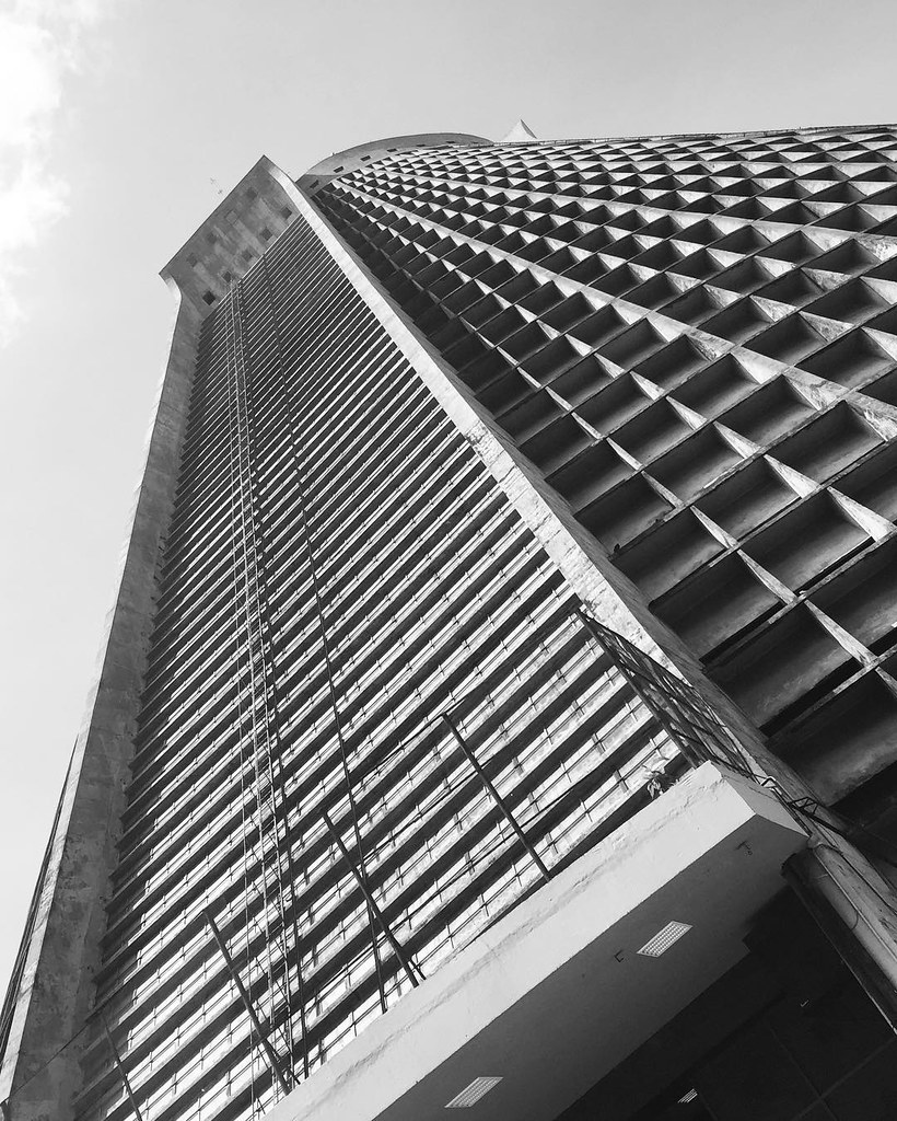
Brutalism emerged in the 1960s and 1970s, initially in architecture, as a response to the need for functional and socially responsible structures. The term 'brutalism' derives from the French "béton brut," meaning "raw concrete." Architects like Alison and Peter Smithson championed the style with exposed concrete structures that highlighted the materials' natural state. This philosophy translates well into graphic design, as discussed in What is Brutalism in Graphic Design?.
Characteristics of Brutalist Design
Brutalist graphic design is characterized by several distinct elements that emphasize rawness and functionality:
- Raw Textures: Use of distressed materials and imperfections to convey authenticity.
- Bold Typography: Large, impactful typefaces, often sans-serif or hand-drawn, make strong visual statements.
- Asymmetry: Dynamic and unconventional layouts that reject traditional symmetry.
- Monochrome Palettes: Primarily uses black, white, and gray shades, creating stark contrasts. Explore more examples in Monochrome: Painting in Black and White.
- Functionality First: Prioritizes practical design elements over decorative features.
Comparisons with Other Styles
Brutalism stands in stark contrast to several other design styles:
| Design Style | Characteristics | Comparison with Brutalism |
|---|---|---|
| Minimalism | Sleek, clean, and simple aesthetics | Brutalism embraces rawness and imperfection |
| Modernism | Focus on form and function | Brutalism adds social commentary and emotional depth. Discover how Brutalist elements are incorporated in modern offices. |
| Swiss Style | Grid layouts and typography | Brutalism favors asymmetry and unconventional layouts |
| Art Deco | Elegant, luxury materials | Brutalism values raw functionality and authenticity |
Elements of Brutalist Graphic Design
Brutalist graphic design incorporates several key elements:
- Typography: Oversized and bold sans-serif fonts that draw immediate attention. A refined take can be seen in Minimal Graphics: The Powerful New Look of Graphic Design.
- Color Schemes: Monochromatic themes with strong contrasts.
- Layout: Unconventional and jarring compositions breaking traditional grid layouts.
- Imagery: Raw, unpolished images and graphics with distressed textures and geometric shapes.
What is Brutalism Design Trend
Iconic Examples
Numerous iconic designs are rooted in Brutalist principles:
- 1972 Munich Olympics posters by Otl Aicher
- The Beatles' White Album cover by Richard Hamilton
- Adidas logo, reflecting simplicity and visual impact
- Obama's 2008 campaign posters designed by Shepard Fairey
Practical Tips for Implementing Brutalism
If you want to incorporate Brutalist elements into your design work, consider these practical tips:
- Embrace raw elements and showcase materials in their natural state. Learn more about the contemporary relevance of brutalism at the Harvard Graduate School of Design.
- Use bold typography and break traditional layouts.
- Experiment with limited color palettes, emphasizing contrast.
- Incorporate textures for depth and tactile interest.
- Balance aesthetics with usability while maintaining a focus on impactful messaging.
Brutalism in graphic design provides a bold avenue for creative expression. Its emphasis on rawness and functionality challenges traditional norms, allowing designers to provoke thought and evoke strong reactions through their work. For more insights into how Brutalism has shaped our built environment, explore Exploring Brutalist Architecture.
