
Three practical directions work best for royal blue: contrast it with orange-family accents for energy, layer adjacent blues for depth, or anchor it with warm neutrals and textured materials for balance.
Understanding Royal Blue and Why Pairings Matter
Royal blue centers on hex #4169E1, a mid-to-deep saturated blue that reads cool in most light. Large painted areas increase perceived saturation, so pair expanses of royal blue with low-contrast neutrals or toned analogs; use high-contrast complements only for smaller accents to avoid visual fatigue. The color wheel shows orange-family colors provide the strongest complementary pop, teal and indigo create layered depth, and warm whites, warm grays, and medium wood tones stabilize the palette in lived interiors.
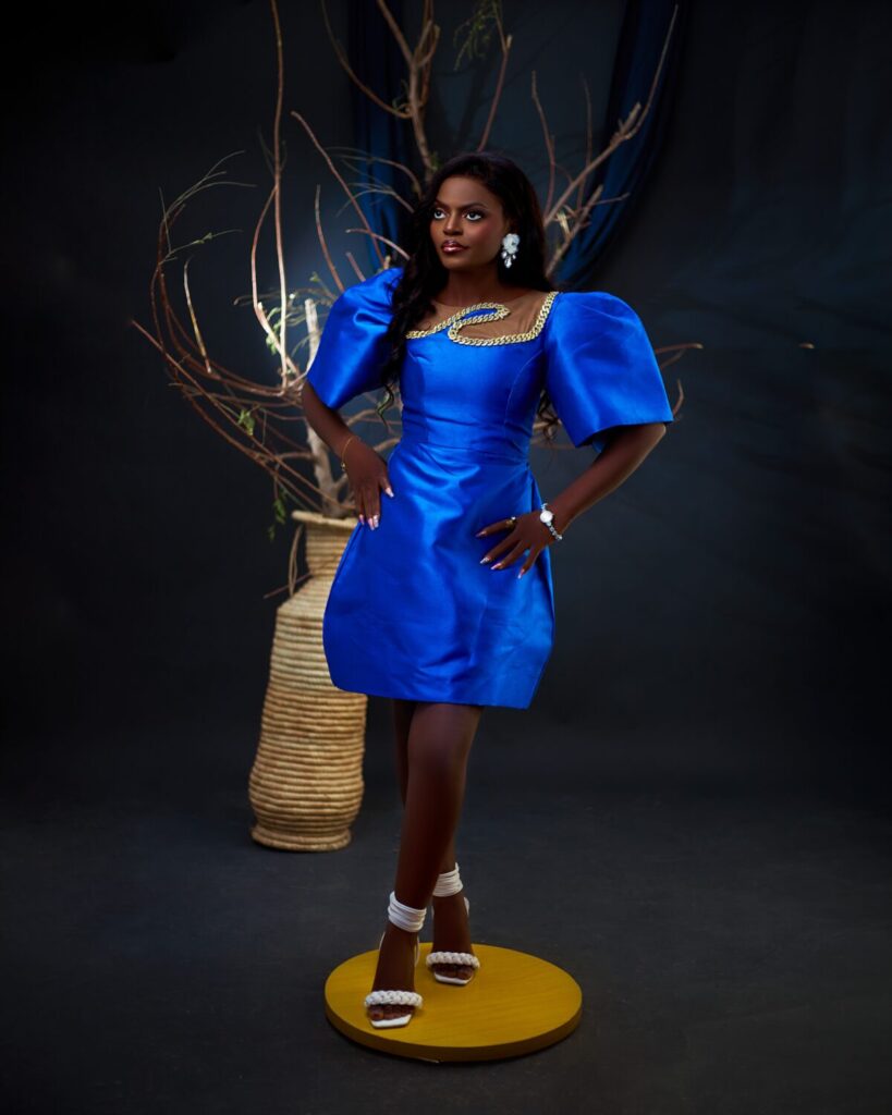
Best Complementary and Accent Colors With Examples
Limit a single complementary accent to roughly 5 to 15 percent of the composition to preserve hierarchy. Practical combinations that work at accessory scale:
- Bright complementary: Royal blue #4169E1 with pumpkin or bright orange #FF7F00 for a statement chair or cushions.
- Warm metallic accent: Royal blue with gold #D4AF37 on lighting, picture frames, or switch plates, using brushed or slightly patinated finishes.
- Muted complementary: Royal blue with mustard #E6B91E in textured throws or rugs to add warmth without high chroma contrast.
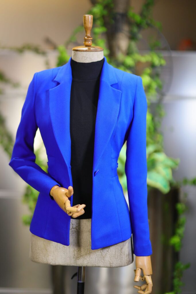
Palettes That Ground Royal Blue in Interiors
For ceilings, walls, and large built elements choose a neutral base and one dominant texture to prevent the blue from overwhelming the room. A practical three-part scheme:
- Base: Warm ivory or soft cream for ceilings and most walls (example hex #FFF8E1).
- Anchor: Royal blue on a single feature wall, a sofa, or cabinet faces (#4169E1).
- Texture: Natural woods (walnut or warm oak), leather, or woven fibers to introduce scale and tactile contrast.
Room-Specific Pairings and Material Advice
| Room Type | Quick Pairing |
|---|---|
| Living Room | Royal blue sofa, warm ivory walls, walnut coffee table; see guidance on integrating a blue couch in the living room for scale and proportion blue couch living room tips. |
| Dining Room | Royal blue accent wall, brushed brass pendant, warm oak table to balance chroma and reflect soft warm light; a focused discussion of blue accent walls provides wall-scale considerations royal blue accent wall. |
| Bathroom | Royal blue tile accents, pale gray vanity, chrome fixtures; use matte tile finishes to reduce glare and perceived saturation. |
Wedding and Event Palettes That Photograph Well
Photography depends on value contrast more than hue. Two concise approaches that reproduce reliably on camera:
- Elegant classic: Royal blue with champagne or ivory and small gold accents; keep metallics restrained to trim and flatware to prevent hotspot reflections.
- Fresh modern: Royal blue with blush or coral plus muted sage green to soften skin tones and florals; test fabric swatches under both flash and daylight because deep blue often reads darker on camera.
Fashion Uses: Wearable Combos and Proportions
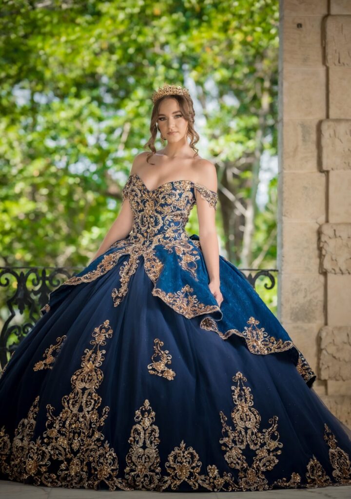
Apply the 60-30-10 proportion rule directly: 60 percent neutral base (white, camel, or gray), 30 percent secondary color (camel, teal, or charcoal), 10 percent royal blue as the focal piece or vice versa depending on the garment. For season-spanning wardrobes, pair royal blue with camel leathers in fall and crisp white linens in summer to keep contrast appropriate to fabric weight.
Paint Mixing and Artist Tips
Treat royal blue as a mid-saturation pigment in paint and mixed media. Darken without shifting hue by adding small amounts of Payne’s gray or a neutral tint; avoid large additions of black which quickly cool the blue. For complementary pop in a painting, introduce cadmium orange or alizarin crimson sparingly to preserve luminosity. Use warm ochres and earth tones to desaturate and create atmospheric receding planes rather than relying on pure black.
Small Accessories and Material Choices That Make Royal Blue Pop
Use small elements to experiment before committing to large surfaces. Effective accents include brushed brass hardware, amber glassware, coral ceramics, or a mustard wool throw. Prefer aged or satin metallics over high-polish gold at larger scales so the metal supports rather than competes with the blue.
How To Build a Final Palette and Test It
Follow these four practical steps when finalizing a scheme:
- Decide the role of royal blue: dominant, secondary, or accent.
- Choose a neutral base: warm white, cream, or a light warm gray with a documented LRV if available.
- Select a single accent: either a complementary orange/coral/mustard or an analogous teal/indigo.
- Add one tactile texture or a muted metallic and test full-size swatches at morning and evening light on the actual wall or surface.
For sourcing swatches, product samples, and ready-made palettes consider practical tools and shopping resources such as Royal blue color combinations. For extracting hex values from images use a palette generator or color-sampling plugin to confirm undertones before ordering large quantities of paint or fabric; color shifts between digital and print are common, so always verify physical samples.
Common Mistakes and How To Avoid Them
Three frequent errors and their fixes:
- Painting every surface royal blue. Fix: Reserve at least one neutral plane to maintain visual hierarchy.
- Relying only on cool, pale neutrals. Fix: Introduce a warm wood or a muted gold to prevent a washed or clinical feel.
- Using high-shine gold at scale. Fix: Choose brushed, aged, or lightly patinated metal finishes to harmonize with saturated pigments.
Quick Shopping and Material Guidelines
When buying paint order 2 by 3 foot sample panels and place them on the intended walls to view at multiple times of day. For upholstery request full-width fabric cuts rather than small swatches and check pattern scale: tightly patterned textiles read as texture and help temper the intensity of royal blue more effectively than plains. For event linens or fashion production always request printed or dyed samples under the same lighting conditions planned for the event.
Final judgment: Royal blue performs best when its role is defined and limited. Use it as a focalizing element supported by a single neutral base and one tactile material, test samples in situ, and select warm metals or woods to anchor saturation in real-world interiors and photography.
Related reading on the site: explore a broader treatment of deep-blue accent walls navy blue accent walls for scale and lighting considerations.
How to Wear Blue | Style Tips and Outfit Ideas You Need to Know:
Incorporating royal blue into designs offers a range of possibilities, from pairing it with neutrals to vibrant hues that create striking contrasts. Each combination can bring out different moods and enhance overall aesthetics in any space.
More from Architecture Adrenaline
For additional insights and tips on color combinations, explore more posts on our social channels. Follow our Instagram for the latest trends and ideas.
