
Lime green reads brightest when it is highly saturated; choose a desaturated variant or a deep anchor if you need it to recede. This guide on colors that go with lime green explains which pairings work for interiors, branding, wardrobes, and accessible UI, then gives practical palettes, contrast tips, and quick tests you can use immediately.
Define the lime green you have
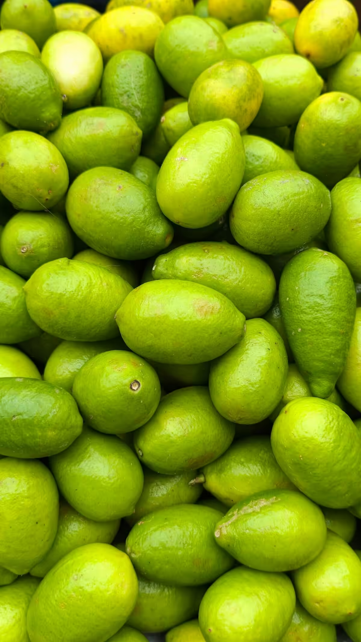
Lime green falls into three practical categories: neon/high-chroma, classic saturated lime, and muted olive-leaning lime. Identify the hex, Pantone swatch, or a physical sample first because yellow content and chroma determine both perceived warmth and the safe contrast range for text and signage. For print and brand work, check recent standard updates since color codes may shift over time; see the Pantone lime green color code update when you need an authoritative reference for matching across media.
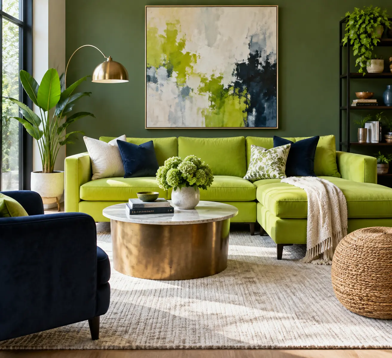
- Neon/high-chroma lime: anchor it with very dark neutrals (charcoal, navy) and reduce area to avoid eye fatigue.
- Classic saturated lime: pair with mid-tone blues and warm creams for balanced interiors and apparel.
- Muted or olive lime: combine with terracotta, warm taupe, or forest green for a botanical, low-contrast scheme.
Neutral anchors that let lime read as intentional
Neutral choices control perceived intensity. Use warm cream or soft off-white to lower the apparent saturation without changing the pigment. Use charcoal or deep gray when text, signage, or a brand mark must be immediately legible against a lime field.
- White or off-white: use for ceilings, large expanses, and trim to keep the room bright while letting lime highlights read as accents.
- Warm cream: reduces the yellow bite of lime and suits hospitality or residential settings where comfort matters.
- Charcoal or near-black: required for accessible type over lime; test at the exact font sizes and weights you plan to use.

Blue pairings that reduce visual tension
Blue reduces lime’s yellow bias and produces stable contrast. Navy and indigo are reliable anchors for cabinetry, signage, and logos because they provide both color contrast and perceived weight. Sky and denim blues create friendlier palettes for apparel and casual interiors while keeping lime legible when used in smaller accents.
Pinks and magentas for lively, controlled contrast
Dusty blush or warm rose tones soften lime for wearable looks or interiors that need warmth. Brighter magenta or hot pink can work for bold brand statements when kept strictly as a tertiary accent and when one saturated color remains dominant. Avoid equal-area saturation of lime and bright pink; make one the backdrop and the other the highlight.
Greens layered for depth and a botanical feel
Layering greens creates depth without forcing high contrast. Combine lime with olive, forest, or bottle green and use the deeper tones as background planes or upholstery. Reserve lime for highlights on cushions, trim, small furniture, or interactive UI badges so the composition reads intentional and legible.
Metallics and black for emphasis
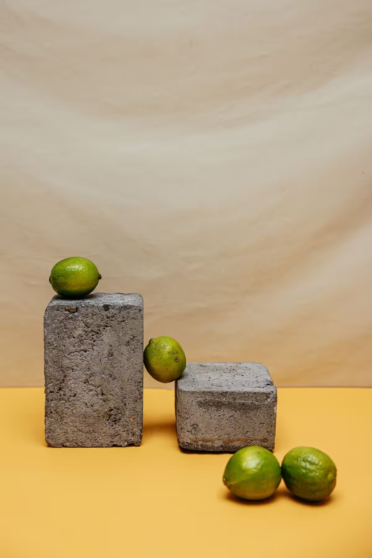
Warm metals such as brass and gold shift lime toward a warmer, premium look and perform well in hospitality and product packaging. Cool metals like brushed nickel or chrome push lime into a modern, technical register. Black plus lime delivers high graphic contrast for wayfinding, logos, and a single feature wall when accessibility is a priority.
Practical palettes by context
Choose the palette that fits the lime variant and test samples under project lighting. For quick buys and ready-made swatches, consider curated products such as Lime green color palette products on Amazon.
| Use case | Core palette | How to apply |
|---|---|---|
| Interior accent | Lime #C7EA3D, Navy #1B3A6B, Soft white | Paint a single feature wall lime, keep ceilings white, add navy upholstery for weight |
| Branding/CTA | Lime #A8FF00, Charcoal #2B2B2B, Cream #F5F0E6 | Use charcoal for body copy, lime for CTAs, and cream for background planes |
| Wardrobe | Lime #9ACD32, Blush pink, Mid denim | Wear lime as a top or accessory, use denim as the neutral base |
Contrast and accessibility rules to follow
Always verify color pairings with an objective contrast checker at the sizes and weights you will use. For normal body text aim for at least a 4.5:1 contrast ratio; large display text should meet at least 3:1. Conventional safe anchors are deep navy or charcoal; white text on saturated lime rarely achieves adequate contrast unless the lime is darkened or strongly desaturated.
How to use lime green on walls and large surfaces
On large surfaces prefer a desaturated lime or mix the lime with a neutral base to lower chroma. If you want a full-room application, test a full-size sample in the intended light and at multiple times of day. For concise advice and additional configurations for walls and accents see Lime Green Decor.
Branding and UI specific advice
Use lime as an accent color in identity systems unless you can pair it consistently with a dark neutral for accessibility. For screen use pick a slightly cooler lime to counteract monitor warmth; for print choose a slightly deeper or less saturated formula. Always supply noncolor cues such as icons or labels for color-blind users so status is not conveyed by hue alone.
Common mistakes and fast fixes
Two frequent errors are equal-area saturation and failing to test under real lighting. Fix both by making lime the highlight, using desaturated or dark anchors for large areas, and running contrast checks on any text placed over lime. For broader green pairing strategies consult the 14 best color combinations resource to adapt combinations to different green tones.
Tests and tools you can use now
- Contrast checkers: validate text and CTA legibility at the exact sizes and weights planned.
- Sample cards: view paint, fabric, or print samples in both daylight and the artificial light you will use.
- Mockups: insert your lime hex into a UI or room render to judge perceived brightness and balance before production.
The design resources cited include contemporary editorial guidance from Homes & Gardens, the Architecture Adrenaline pairings linked above, and recent Pantone updates to lime-related swatches; use these sources when matching printed and digital color systems or when specifying paint and fabric formulas.
If you have a specific lime hex, a room dimension, or a UI screen, paste the hex and context below with the lighting conditions and materials you plan to use. I will suggest a precise palette, contrast pairings, and where to apply each color.

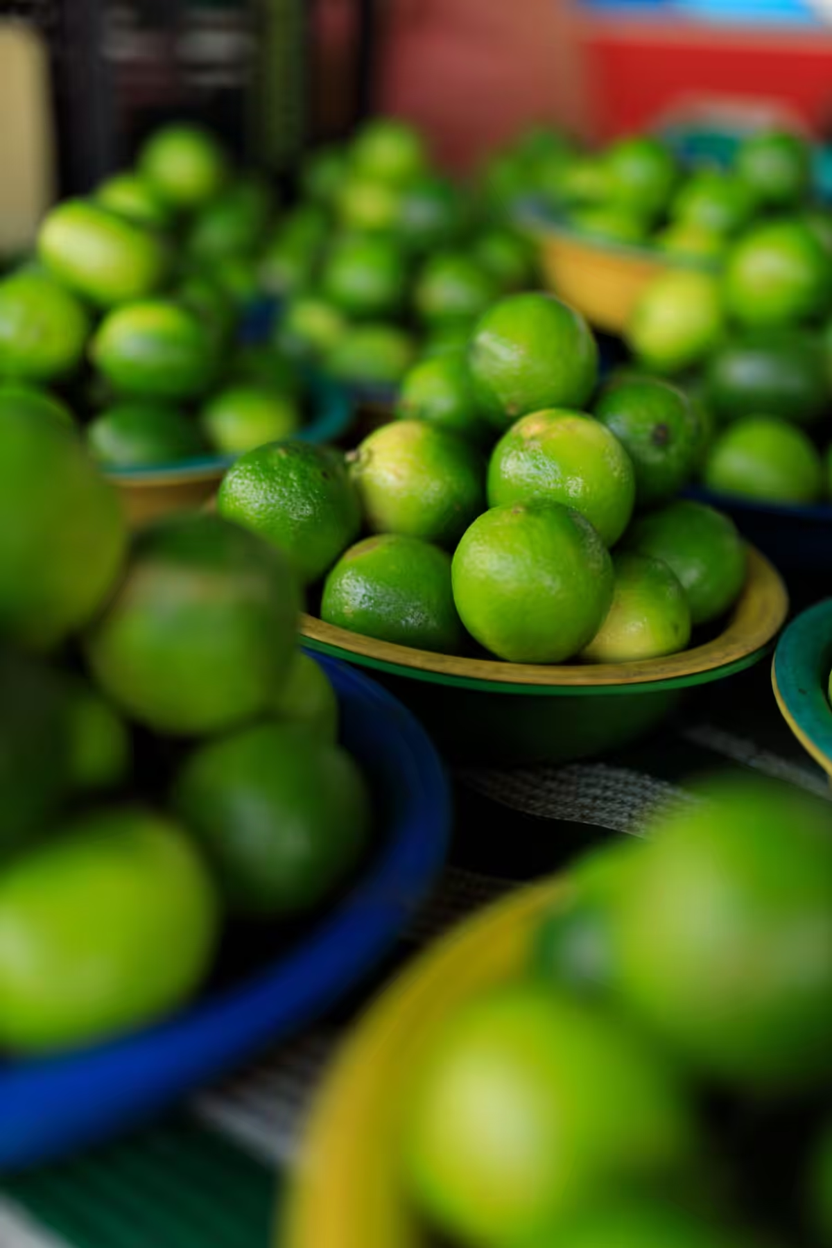
Related video
Lime Green: A Color Journey

It’s bold, it’s fresh, and it makes a statement: lime green is the superstar of vibrant color palettes, and pairing it just right can elevate any interior or design project.
Balancing Boldness with Neutrals

Lime green can easily take center stage, so pairing it with soft neutrals like white, beige, or gray is a surefire way to maintain balance. Imagine a lime green accent wall set against a backdrop of white furniture or neutral-toned rugs—instant harmony. The contrast allows lime green to shine without overwhelming the senses.
Creating Contrast with Complementary Colors
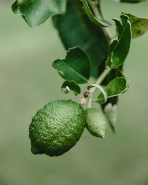
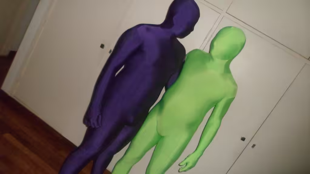
Looking to amp up the drama? Opposites on the color wheel, like purple or magenta, create striking, high-energy combinations with lime green. For example, a lime green throw pillow paired with a luxurious violet chair can deliver a sophisticated and dynamic vibe, making the space feel both daring and elegant. Explore a more comprehensive list of colors to inspire complementary pairings.
| Color Pair | Effect | Recommended Use |
|---|---|---|
| Lime Green + Gray | Clean and calm balance | Office spaces or modern kitchens |
| Lime Green + Violet | Bold and dramatic | Living rooms or statement walls |
| Lime Green + Beige | Soft and natural | Bedrooms or serene spaces |
Energizing Spaces with Bold Pairings

Don’t be afraid to think big and vibrant. Lime green loves other lively shades like turquoise, orange, or hot pink. A “tropical oasis” palette—mixing lime green, golden yellow, and turquoise—can create a vacation paradise right in your living room. Pro tip: Use lime green as an accent and let the other hues share the spotlight for a cohesive, playful look.
Nature-Inspired Shades

For a calmer, eco-chic feel, pair lime green with other natural greens like forest or yellow-green. Inspired by lush meadows, these combinations bring the serenity of the outdoors inside. Think table runners, throw pillows, or even a patterned feature wall that ties these hues together.
In Design and Decor

Whether it’s your home, branding for a business, or even an outfit, lime green adapts effortlessly. A lime green lamp in an otherwise minimalist room, a funky lime green logo with magenta accents, or neon-lime sneakers paired with neutral clothing—each makes a bold yet thoughtful statement.
So, how do you see lime green fitting into your next project? Share your favorite pairings or unique uses in the comments below!
Green Striped Throw Pillow Set
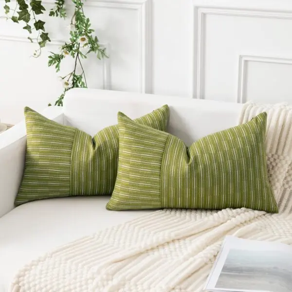
Elevate your living space with this vibrant green striped throw pillow set. Designed with a modern touch, these pillows offer a pop of color and texture to any couch or bed. The soft fabric and plush filling provide ultimate comfort while the timeless stripe pattern adds a stylish accent to your decor. Perfect for cozying up during a movie night or brightening your living area, these pillows are an ideal blend of function and flair.
Modern Geometric Marble and Lime Green Curtains
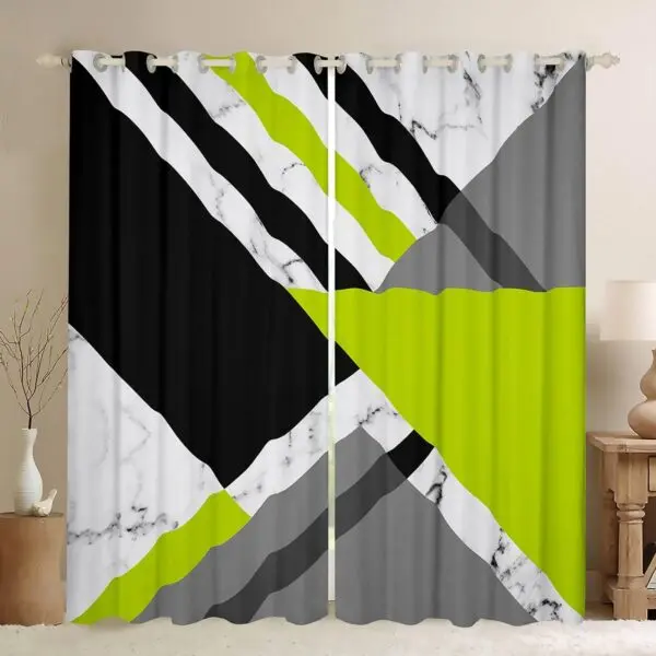
Transform your space with these striking geometric curtains. Featuring an eye-catching mix of black, grey, white marble, and vibrant lime green, they add a bold, modern touch to any room. Crafted from high-quality fabric, they ensure privacy while complementing your decor. Easy to hang with grommet tops, these curtains are perfect for updating your living room, bedroom, or office with a splash of contemporary style.
Retro Geometric Green and Gray Comforter Set
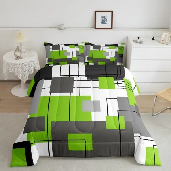
Transform your bedroom into a modern art haven with this vibrant Retro Geometric Green and Gray Comforter Set. Featuring bold green, white, gray, and black rectangles and lines, it adds a dynamic visual interest to any room. Made from soft, high-quality materials for ultimate comfort and durability, this set ensures restful sleep. Perfect for those who love a splash of color and contemporary style in their decor.
As you continue your vibrant journey with lime green, remember that colors are much like stories waiting to be told. We'd love to see how you incorporate lime green into your projects. Why not share your creations with us? You can find us on Instagram, where we showcase stunning designs and inspirations—you won't want to miss it! Follow us at Architecture Adrenaline on Instagram for a daily dose of color insights. If Pinterest is more your style, check out our curated boards at Architecture Adrenaline on Pinterest for endless ideas on color combinations and decor tips. Join the conversation on X (formerly Twitter) for quick tips and engaging discussions. Lastly, don't forget to connect with our community on Facebook where we share our favorite picks and hear about yours. Let's keep exploring the wonderful, vivid world of colors together!
Which colors enhance lime green?
Contrasting Colors: Pair lime green with complementary hues such as purple or magenta to create a vivid contrast that accentuates its brightness. Play with variations of lime green, using gradients and different shades, to add depth and character to your design.
Which colors harmonize with light green?
Palette Harmony: To maintain balance with light green, particularly its vibrant tones, it’s important to complement it with neutral hues. Colors such as cream, white, or beige can tone down the brightness and create a soothing and inviting environment.
What colors coordinate well with neon green?
Balance and Harmony: Neon green pairs effectively with red, as its complementary color brings balance. Other colors like white, brown, and yellow can also complement neon green, helping to create a look that's lively but not overwhelming.
What is the most complementary color to green?
Dynamic Contrast: Red is directly opposite green on the color wheel, making it the most contrasting choice. This complementary combination results in a bold, stylish look that brings out the best in green.
When choosing colors that pair well with lime green, consider combinations that create balance and contrast. Shades such as navy blue, soft gray, and white can complement lime green effectively. Additionally, warm hues like coral and peach can soften lime green’s brightness, adding warmth to the space. The goal is to find colors that enhance and highlight lime green without overwhelming it.
More from Architecture Adrenaline
For more insights and design inspiration, check out our social channels for additional posts like this one. Follow our work on Instagram to stay updated on the latest trends and ideas in color pairing and design.