
Ecru is a warm linen-like neutral; use it as a stable base color that lowers perceived contrast and lets wood, metal and muted accents read without competing. This article gives precise hex references, practical matching steps, tested pairings and sourcing guidance so you can specify paint, textiles or trim with confidence.
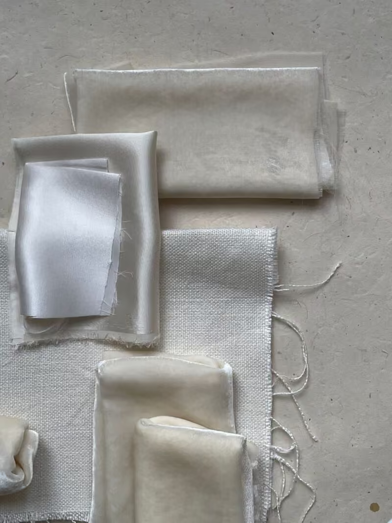
Ecru Color Data You Can Use
Two commonly used digital references for ecru are #E0CD95 and #D0BA94. These swatches sit in the warm yellow-beige range, with high lightness and low saturation, so they appear neutral in daylight and warmer under incandescent or warm LED sources.
Always verify by requesting physical swatches and the manufacturer’s RGB/HEX or LRV values. For industry paint references consult the Sherwin-Williams product page linked below and use digital toolkits such as Figma for initial mockups. When you move from screen to site, compare the printed or painted sample against real materials rather than relying on a single digital file.
How Ecru Behaves in Rooms
Ecru reads as a background color rather than a focal accent. On broad vertical surfaces it reduces perceived contrast and softens daylight; on small objects it can read yellowish or cream. Use eggshell or matte paint on walls to preserve the linen quality; high-gloss finishes increase specular highlights and can make the color look cooler.
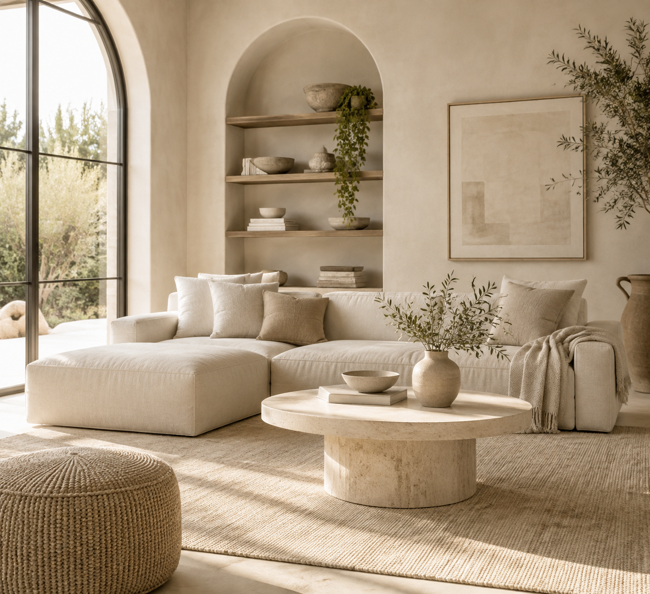
- Site-test a 24 by 24 inch sample on the primary walls and on the wall opposite windows.
- Evaluate the sample against trim, flooring and the finish samples you plan to keep in the room.
- Keep a single dark anchor, such as charcoal trim or a walnut cabinet, to maintain depth in the composition.
Rules for Pairing an Ecru Color Palette
Use these concise rules when building an ecru palette for interiors or cabinetry.
- Contrast. Introduce deep charcoals, walnut or soft navy as architectural anchors to prevent a washed-out look.
- Cool balance. Add desaturated blues or sage greens to temper warmth without creating visual tension.
- Texture first. Prioritize woven linens, honed stone and napped leather over bold prints to preserve the refined, tactile quality of ecru.
- Sheen matters. Select matte or eggshell paint and low-luster upholstery weaves to maintain the linen effect.
Eight Ecru Color Combinations to Try
These combinations reflect common material roles so you can adapt each idea to paint, textiles or cabinetry.
- Ecru + Charcoal. Use charcoal for trim, baseboards and hardware to create crisp modern contrast.
- Ecru + Walnut. Specify walnut cabinetry or shelving to introduce warm, medium-dark wood grain against ecru walls.
- Ecru + Desaturated Sage. Pair with aged brass fixtures for a warm, muted palette suited to kitchens and bathrooms.
- Ecru + Muted Denim. Paint a matte denim-blue accent wall to form a calm visual anchor without heavy contrast.
- Ecru + Soft Navy. Use navy upholstery or drapery to ground seating areas while keeping contrast controlled.
- Ecru + Honed Stone Gray. Select honed stone counters or floor tiles to add subtle coolness and tactile variation.
- Ecru + Olive-Green Leather. Introduce small leather accents or stools to add a durable, textured focal point.
- Ecru + Matte Black. Reserve matte black for window frames, lighting and slim hardware to provide a crisp architectural edge.
Material and Manufacturer Notes
Cabinetry and finish manufacturers often use the name ecru for several distinct samples. Confirm finish names, gloss level and sample photos before ordering. For example, kitchen manufacturers that publish coordinated finish systems may offer lacquer, mineral surface and veneer versions with different light reflectance values; always request the physical sample for the specific finish variant you plan to install.
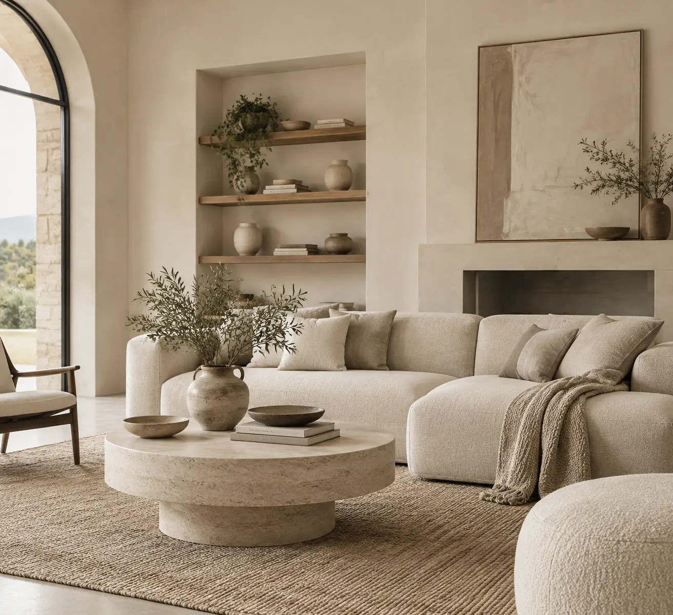
For additional guidance on selecting a single-color strategy, see the discussion of monochromatic approaches in the site’s practical primer linked below and consult manufacturer finish pages when specifying cabinetry or lacquer options.
Ecru in Automotive Interiors
Automakers apply the name ecru to leather and synthetic trim options, but the visual match varies by maker and model year. When repairing or replacing automotive upholstery request the OEM trim code and a physical swatch from the dealer or parts supplier; the trim code is the reliable identifier, not the color name.
Contrast, Accessibility and Graphic Use
Ecru variants typically provide adequate contrast with dark grays and black for AAA-level legibility in signage and controls. White type on ecru generally fails accessibility checks. For small-scale graphics and controls use carved moulding, strong dark type, or black hardware to ensure legibility and tactile clarity.
| Item | Typical Value | Use Tip |
|---|---|---|
| Hex Reference | #D0BA94 or #E0CD95 | Use the exact hex for digital mockups and verify with physical swatches for paint and textiles |
| Contrast With Black | 7.5:1 to 20:1 (variant dependent) | Suitable for body text and controls when paired with very dark foregrounds |
| Finish | Eggshell or matte recommended | Preserves the linen appearance and reduces cool specular highlights |
Testing and Practical Steps for Home Projects
Follow this checklist to avoid the common pitfall of specifying color from screens alone.
- Order a 24-inch wall sample or a 1-quart paint sample and mount it where the room receives its typical daylight.
- Lay the sample adjacent to the flooring, wood finishes and metal hardware you plan to keep.
- Inspect the sample at morning, mid-day and under the room’s artificial lights.
- When matching leather or automotive trim, request the OEM trim code and a physical swatch from the dealer or manufacturer.
Where to Source Swatches and Samples
Never rely on a single retailer for textile or paint matching. Order paint samples and manufacturer fabric swatches, and bring a fabric swatch to the paint store when you request a tint. For quick textile sampling consider online marketplaces that offer broad fabric options; one practical search path is for ecru color swatch fabrics on Amazon when you need rapid, low-cost samples to compare against hardware and flooring.

For curated advice on exterior and coordinated palettes, consult the site’s guide to choosing exterior house colors and the monochromatic interior palette primer linked below when you need system-level decisions across walls, trim and roofs.
Additional References and Tools
Technical and palette resources cited in this article:
- Sherwin-Williams SW 6135 Ecru product page, Use this for LRV and product-specific technical data when specifying paint.
- Figma ecru color reference, Useful for initial digital mockups and team handoffs.
- Eggersmann ecru design concept, Manufacturer guidance on coordinating ecru across finishes.
- Eggradients palette downloads, Downloadable hex palettes for quick scheme testing.
- M. B. Mayfield collection at eGrove, Context on place-name usage related to the color name.
- ecru color swatch fabrics on Amazon, A fast source for inexpensive fabric samples to compare on site.
- Monochromatic Color Scheme Interior Design, Strategy for using variations of a single neutral across finishes and textiles.
- Choose Perfect Exterior House Colors Easily, Practical steps when extending ecru to exterior cladding and trim.
- Ecru Color, Site article focused on definitions and common pairings for ecru.
- What Colors Go With Cream, Related palette context for cream and beige family colors.
Related Video
The ecru color palette offers a versatile foundation for various design projects. It blends effortlessly with different colors and materials, making it suitable for modern and classic styles alike. By incorporating ecru into your designs, you can achieve a balanced and inviting atmosphere.
More from Architecture Adrenaline
For those interested in exploring more about color palettes and design inspiration, our social media channels provide additional insights. Check out our Instagram at Architecture Adrenaline for regular updates and inspiration on architectural trends and color usage.